Wasichay
A responsive, tiny home e-commerce site
Project Details
The problem
Finding and buying a tiny home is difficult and confusing with lack of practical information and the capacity to visualize options.
The solution
Wasichay’s responsive e-commerce offers a cohesive experience of transparency, customization, and guidance giving users freedom and control of their experience.
Role
UX Researcher and Designer, mentored by Anna Brenner
Why care?
The ecological and housing crisis
There is currently a housing and ecological crisis that is affecting the availability of homes on the market. As wealth grows and inequality widens, the prohibitive price of buying a regular size home prevents many people from ever owning one.
Adding to these the realization that bigger is not better and an interest in living closer to the land, they are all sparking a passion for simpler living.
Wasichay means my tiny home in Quechua, the indigenous language of a culture that values living in harmony with the land.
The Tiny Home Ecosystem
Market Research
Understanding the tiny home problem space
Insights on patterns and trends
The main goal was to understand the tiny home problem space through patterns and current trends in this niche industry. Some insights:
The environmental aspect is driving market growth.
Boomers and Millennials are target users.
landscape analysis
Finding opportunities in existing gaps
Multiple UX Challenges
While some of the products showcased excellent energy efficiency features and new technologies, most sites suffered from UX problems including obscure information architecture and difficult navigation, lack of customization and transparency.
competitive analysis
What’s missing in the competitive landscape?
Comparing features to better differentiate Wasichay
Also compared the features being offered by these tiny home companies. Most didn’t offer reviews nor press. Few offered the ability to save content or customize tiny homes. None offered a wizard for guidance in finding a tiny home. Overall, no relationship or trust building with users.
User Research
user interviews
Connecting with folks who want a tiny home
I conducted user interviews to discover the tiny home mental model.
I started this project with assumptions that in a sea of good intentions (economic, environmental, lifestyle), finding and buying a tiny home can be a confusing and daunting experience.
The goal of User Research was to conduct user interviews (7) and gather insights on user needs, motivations, and pain points as well as the mental model around finding, configuring, and purchasing a tiny home.
ANALYZING data
Finding patterns
I discovered common themes that shine a light on user pain and struggles.
What are the goals, needs, and pain points as well as common roadblocks users experience on their tiny home journey?
personas
Discovered 2 User Segments
Research driven archetypes
Both archetypes were generated from data from the interviews. Nothing was made up. Every detail is real including quotes.
SYNTHESIZING data
Drawing insights and HMWs
Overarching questions to guide Design
I was most surprised by the need to address different levels of interest and commitment to build trust.
Defining the Problem
UX challenge
Narrowing down the scope
I prioritized an overwhelming amount of insights and limited the MVP scope.
An exercise in divergent and convergent thinking, I narrowed down the scope and focus on the main problems and needs that Wasichay will address.
good for business & users
Wasichay high level goals
presence
Establish Wasichay as leading brand of tiny home marketplaces.
brand
Develop a value-driven brand that builds trust and relationships, and empowers users.
conversion
Create an intuitive process for finding, configuring and purchasing a home.
the nitty gritty
Product Requirements
Wasichay’s MVP
I prioritized features that meet user needs and business goals.
ux challenge
Developing a content Strategy
I used the art of storytelling and progressive disclosure to reduce cognitive load.
I spent quite some time on content strategy options that use progressive disclosure to unfold the story and avoid issues of overwhelm due to cognitive load.
ux challenges
Clear Information architecture
I crafted a site structure that could better show informational content.
Landscape analysis and user research revealed that existing websites and online marketplaces with tiny home information are hard to access and navigate. I designed Wasichay with the ultimate goal of purchasing a tiny home.
task flow
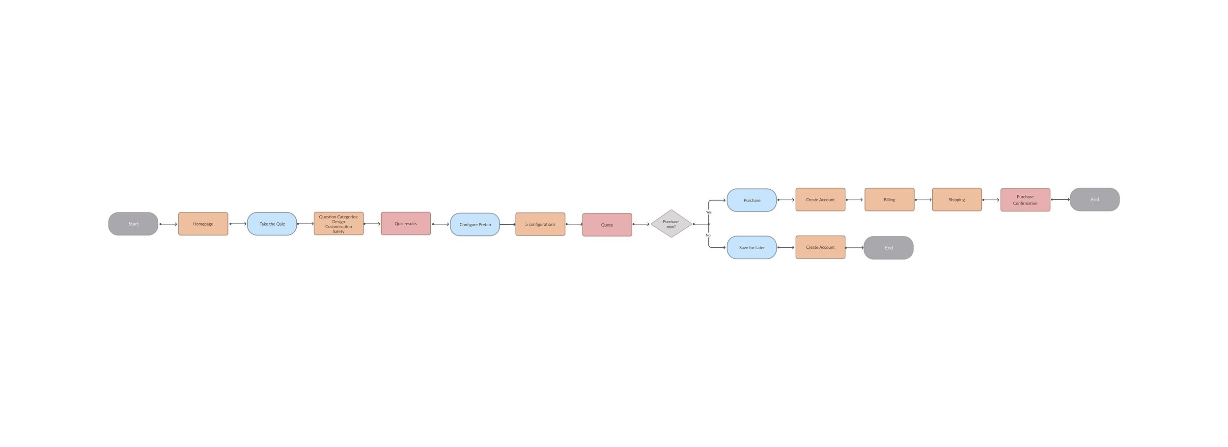
The happy path
Independent, sequential flows
Based on user research, it was important to provide a cohesive site with clear and relevant information with a clear path to complete the task of finding, configuring and purchasing a tiny home, in their own time.
user flow
Empowering Users
Building a relationship based on trust and freedom
All flows are connected, but there is no pressure on users. They can sleep on things and go at their own pace. This lack of pressure builds trust.
Wireframing
homepage wireframe
Usability, functionality & storytelling
I fine tuned the structured content and hierarchy.
Guided by research, the homepage wireframe explores how to carry out the content strategy in a way that tells a better story and serves the need for practical information.
wizard wireframes
Designing for interaction and engagement
Find, configure, and Purchase your tiny home Flows
I played with hierarchy and structured content for a guided experience for all flows.
flow #1 find your tiny home
FLOW #2 CONFIGURE YOUR TINY HOME
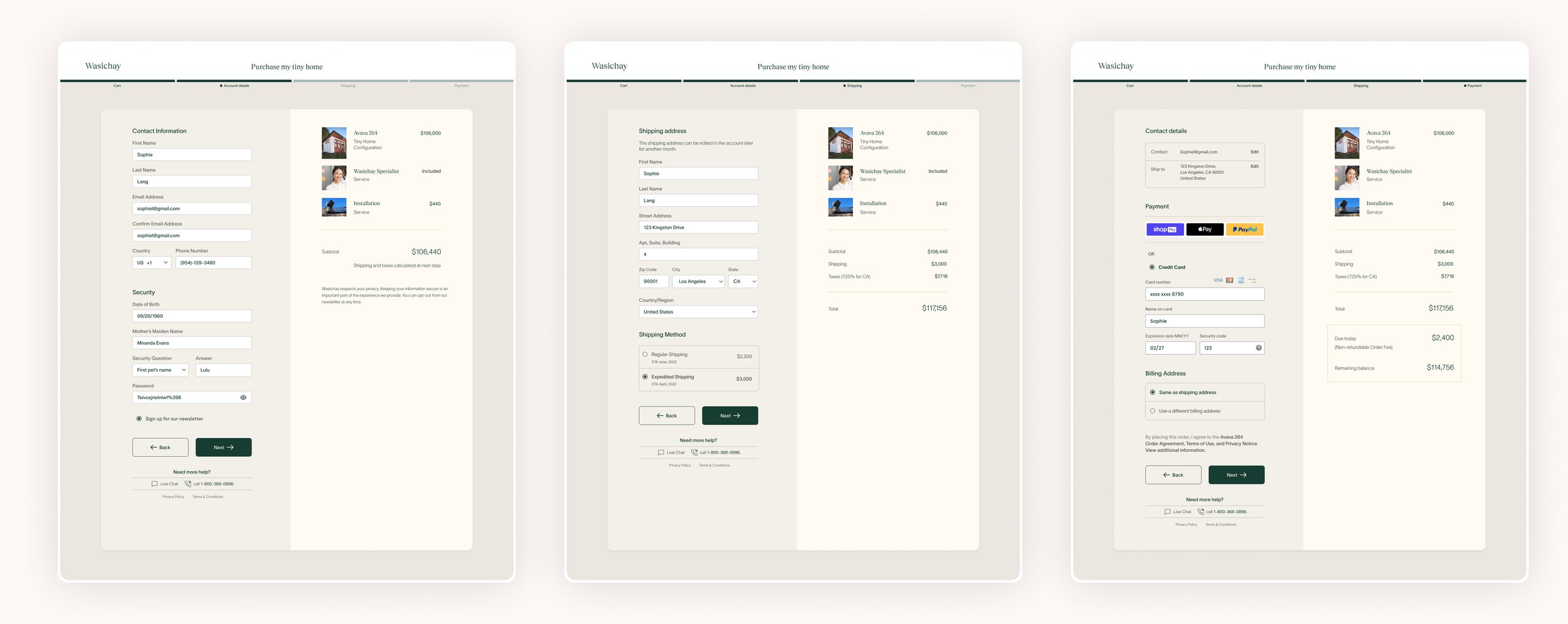
FLOW #3 PURCHASE YOUR TINY HOME
High Fidelity Responsive Design
branding + visual language
A brand that connects
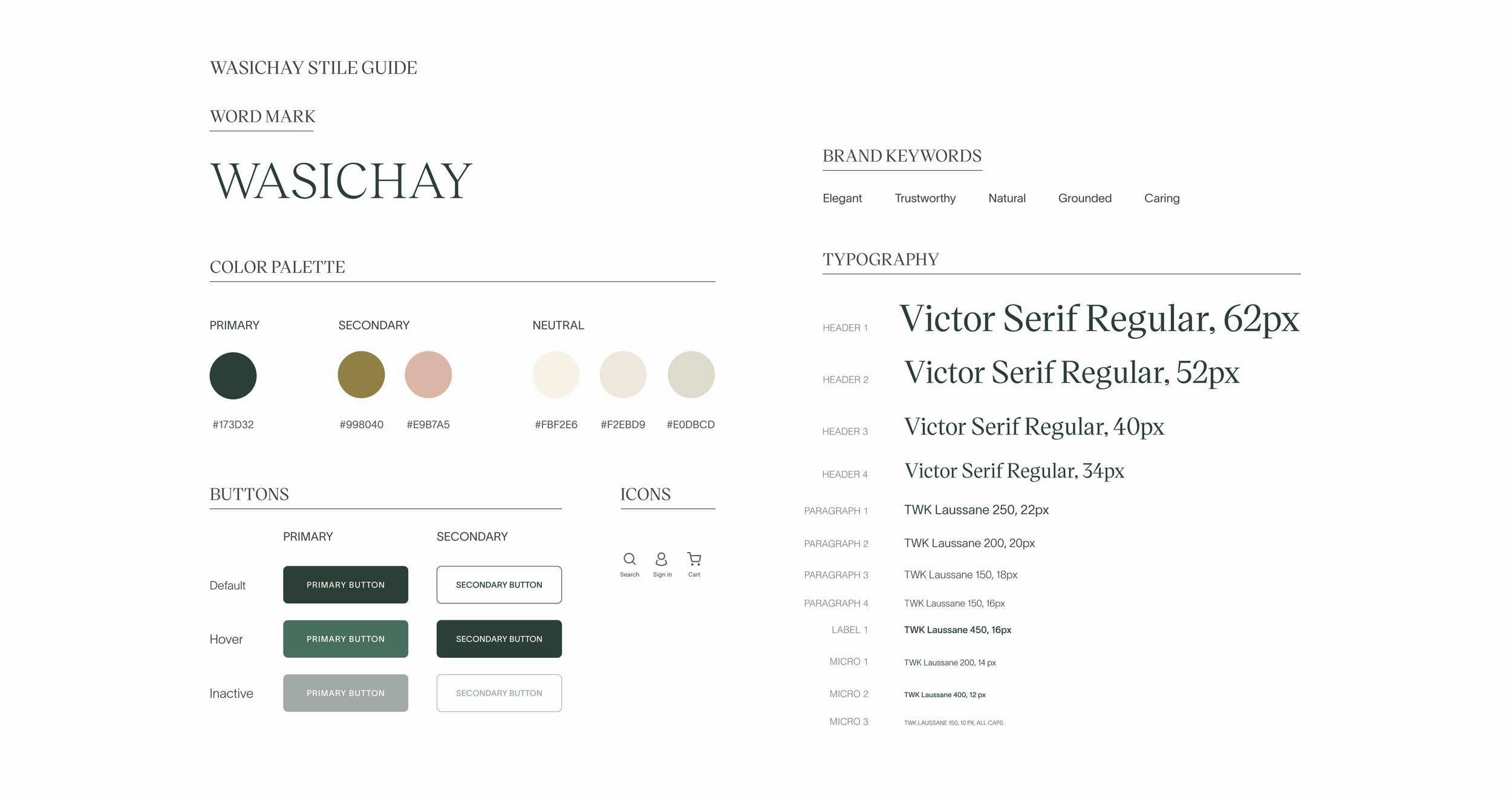
Grounded. Natural. Trustworthy
Even companies that offer good quality tiny homes suffer from poor and outdated branding. We created a brand that feels related to tiny homes, nature, and landscape. A brand that is elegant, grounded, and trustworthy.
Color palette
The colors work for a brand connected to nature. They have an elegant and grounding effect.
typography pairing
Typography choices of Victor Serif and TWK Laussane contribute to the brand’s personality.
visual assets + illustrations
Natural photography inspires an emotional connection . Plant and flower illustrations add an organic touch.
UI Strategy
Refining the UI
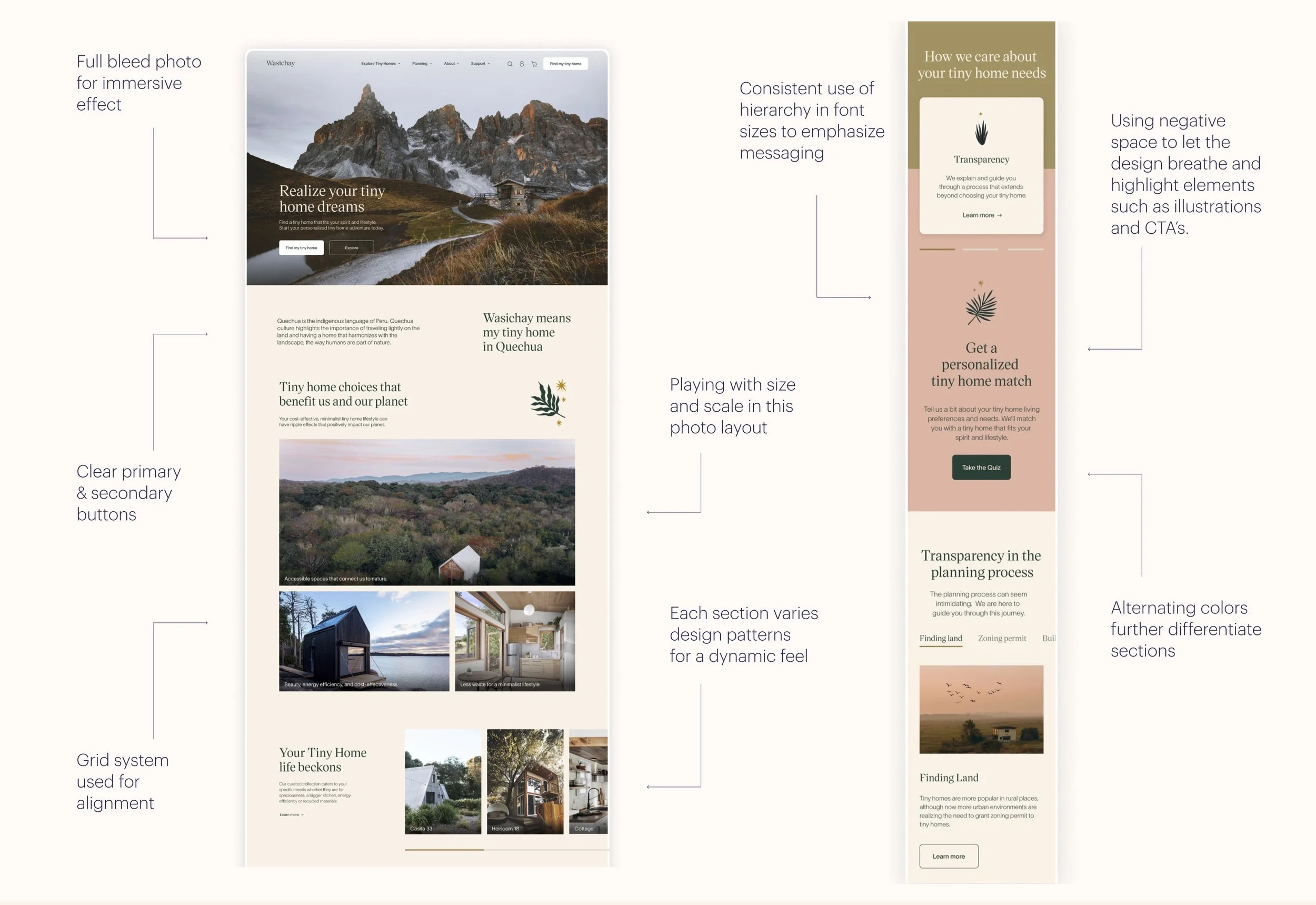
I iterated multiple times until I achieved a satisfying level of consistency and balance through the use of hierarchy, visual structure, alignment, repetition, spacing and scale.
desktop Homepage
An Immersive & Emotional experience
I designed the homepage to inspire emotional connection for the lifestyle a tiny home affords.
Each homepage section helps unfold the story and provides Wasichay users with various points of access for whatever action or level of engagement they are ready for.
Multiples ways of exploring
The homepage offers multiple ways of exploring tiny homes and starting the happy path.
Freedom to engage
Wasichay empowers users to engage at whatever level of engagement they are ready for—finding, configuring, or purchasing, at their own pace.
transparency
Users expressed the need for transparency, which informs how Wasichay offers practical information on the planning process and possible roadblocks.
Deeper level of guidance & support
For users who want handholding in the planning process or even more personalized experience, they can use the care team services.
social proof
Testimonial and instagram photos of Wasichay owners validate its value and offer social proof.
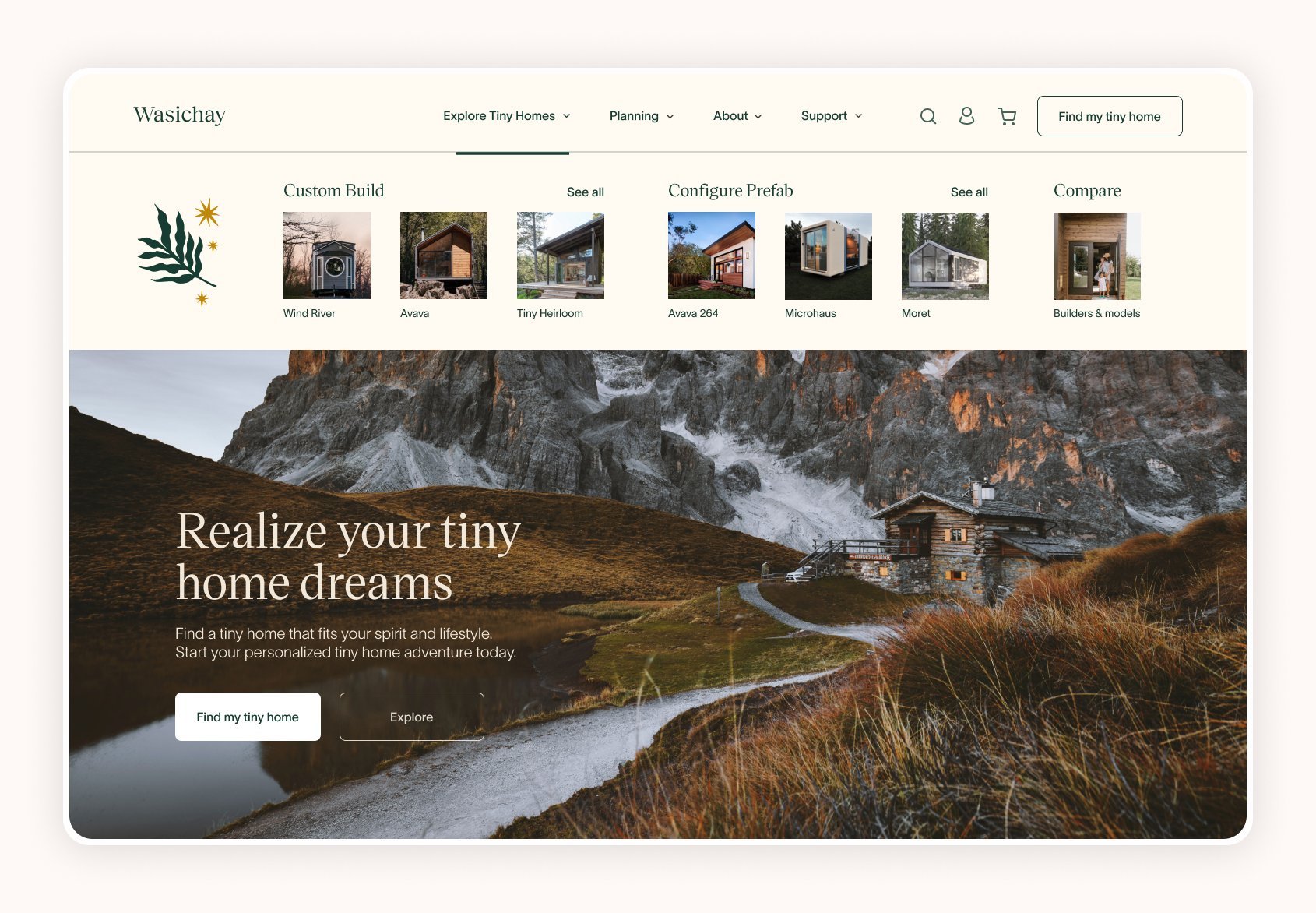
Subnav
Visualizing tiny home options
The Subnav navigation uses images to visualize options on desktop & mobile.
The subnav experience evolved to offer users visual cues, glimpses of what they may find if they keep exploring. This solution fulfilled the user’s need to visualize options.
flows
Strategy for Wizard Flows
All wizard flows offer an engaging experience, based on real user needs.
reduction of cognitive load
Even though the Find your tiny home Flow is long, there is an effort to reduce cognitive load with ample white space and a focused visual experience.
Visualization
Visualization through high resolution photography helps users make more informed decisions when it comes to selecting preferences and options to configure.
InterstitiaL moments
The wizards acknowledge user thoughts and feelings and appeases concerns as they complete each section of the wizard. This looks like a screen with copy and an animation.
flow #1
Finding your tiny home Flow
The Find your tiny home wizard Flow offers an interactive experience based on the user need for guidance.
User Research revealed some insights that emphasized the pain around feeling confused in the midst of many options in an unclear process of finding a tiny home. There is a clear need for guidance.
Length of wizard
Target segment users who are serious about buying felt the length was appropriate for such an important purchase.
sections & target questions
The wizard is divided in well thought out sections that inquire into different aspects of tiny home characteristics with targeted questions to help curate tiny home options.
progress bar & tool tips
It is important to let users know where they are in the process and access information if they need it.
flow #2
Configuring your tiny home Flow
The Configuring your tiny home Flow offers a personalized and curated experience, based on user need of customization.
This wizard guides the user to configure a prefab tiny home. These wireframes explore ways to showcase the tiny home features in a visual to help users make informed decisions.
visualizing options
This flow allows users to answer questions that enable them to visualize their choices and make informed selections.
cost update
Each subsequent screen updates the price of the tiny home based. on the choice of the configuration.
ability to edit & save
Users can leave the wizard at any point and their progress will be saved. At the end of the configuration, users can review, edit, or save for a future purchase.
flow #3
Purchasing your tiny home Flow
This flow builds upon established trust and transparency with editable carts based on Shopify and Tesla models.
ability to edit cart
Users need to be able to edit their configuration even last minute, right before purchasing.
security
The message that Wasichay offers a secure transaction offers a sense of relief to some users, ash shown in usability testing.
FINANCING
Wasichay does not offer financing yet, but it would be a useful offering for Phase 2.
mobile Homepage
Wasichay on mobile
I tried to maintain an expressive and immersive experience on smaller real estate.
mobile
The Subnav
I tried to maintain the same level of emotional and immersive experience on the tiny screen.
Usability Testing
Does Wasichay feel supportive & trustworthy?
The usability testing method was individual moderated remote study sessions with 4 participants who shared their screen via zoom.
100% of participants felt an emotional connection to the brand and expressed feeling relaxed and calm as if in nature.
wasichay builds trust
Participants noted the site allowed for different levels of involvement and commitment. The ability to save content and not push for a purchase made participants feel more at ease. For them, the freedom to to choose “when” to purchase builds trust.
wasichay’s target user segment
While the segment of younger users felt overwhelmed by the happy path wizards, the older segment really enjoyed and appreciated the thoroughness of the flows. For them, a purchase of this magnitude demands this thorough level of detail.
“I expected this wizard length for this kind of purchase. This ability to save encourages an ongoing relationship. In the end. Does it feel trustworthy? YES.”
Usability Participant
Priority Revisions
Transparency
Participants showed how having the breakdown of the configuration on both the configuration wizard (last page) and the checkout flow (first page) would further enhance transparency.
clear language
User need for clearer language that avoids lingo as in the case of the word “vernacular” in the “find my tiny home” flow.
storytelling & branding
I got helpful feedback from three designers at Zendesk:
Design feels cohesive and communicates the brand well. Include the story of Wasichay on the homepage to help users further resonate and connect with brand.
Main CTA on the hero area could better reflect the nature of the wizard with a stronger call to action from “Take the Quiz” to “Find your tiny home.”
The photo chosen for the care team section does not seem to align with the brand.
Reflections
Learnings
Empower the User
Given the constraints of time for this project, I feel that I was able to focus on a particular set of unmet user needs for the MVP. It was rewarding to see users connecting to Wasichay—feeling seen and heard and most of all, empowered.
Phase 2 - Turn Wasichay into a hub for all things Tiny Home.
I was aware of the need to turn Wasichay into a one place destination for users seeking not only to purchase a tiny home – but also to find inspiration, learning, and belonging in a vibrant community.
Trust the design process
There is so much I learned with this project including trusting the process and not rushing into solutions but letting them unfold, change, and transform.


